The Foundry | New Alphabet Font Family by Wim Crouwel 4×OTF 4×TTF $295seeders: 4
leechers: 0
The Foundry | New Alphabet Font Family by Wim Crouwel 4×OTF 4×TTF $295 (Size: 59.9 KB)
Description New Alphabet is a parametric typeface designed by Wim Crouwel, released in 1967. New Alphabet was a personal, experimental project of Crouwel. The typeface was designed to embrace the limitations of the cathode ray tube technology used by early data display screens and phototypesetting equipment, and thus only contains horizontal and vertical strokes. Conventional typefaces can suffer under these limitations, because the level of detail is not high enough, restricting legibility. Crouwel wanted to adapt his design to work for the new technologies, instead of adapting the technologies to meet the design. Since his letter shapes only contain horizontals and verticals, some of the letters are unconventional, while others are difficult to recognise. Because of this, the typeface was received with mixed feelings by his peers. Most of the letters are based on a grid of 5 by 9 units, with 45-degree corners. There is no differentiation between uppercase and lowercase glyphs. Many of his peers were of the opinion that the design was too experimental and that it went too far. The typeface received a lot of newspaper coverage, which sparked a lively debate over typefaces as an art form, compared to their practicality in everyday use.[2] For Crouwel, it was mostly a theoretical exercise. ‘The New Alphabet was over-the-top and never meant to be really used. It was unreadable.’ New Alphabet was one of 23 digital typefaces acquired by the Museum of Modern Art in January 2011 for its Architecture and Design Collection. This collection of typefaces were some of the first acquired by MoMA, and were on display in a 2011-2012 exhibition called Standard Deviations: Types and Families in Contemporary Design, or Standard Deviations. http://www.moma.org/collection/works/139322 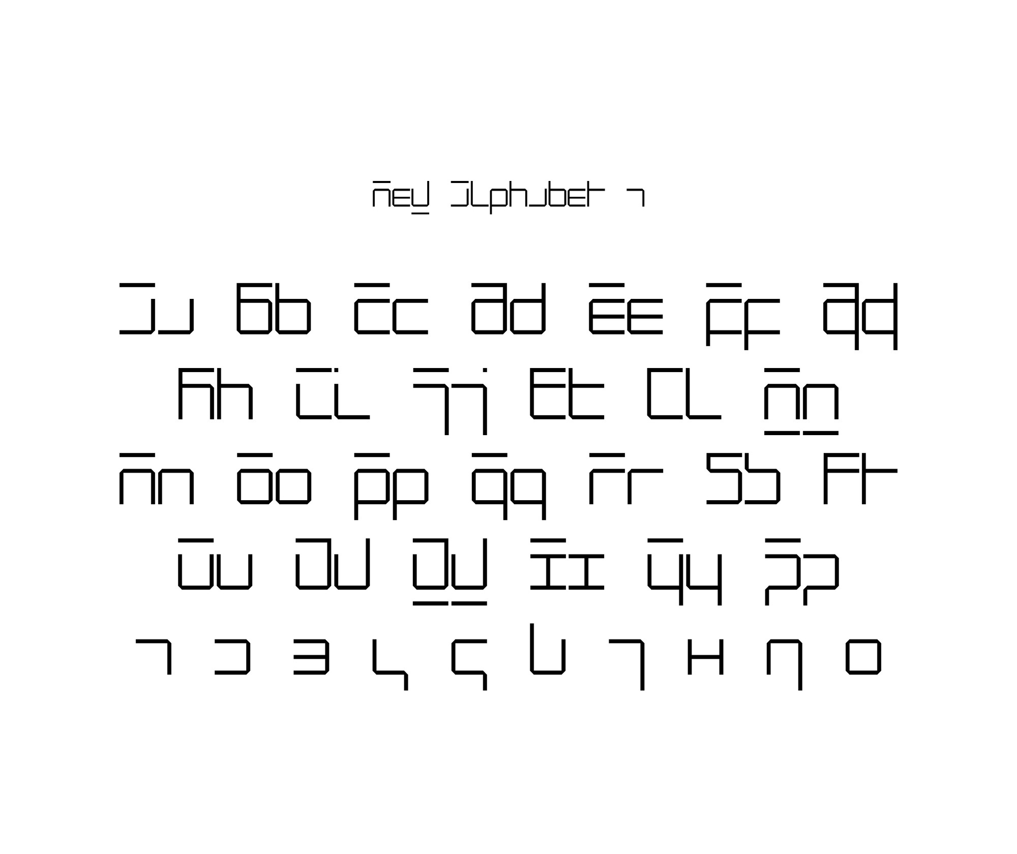 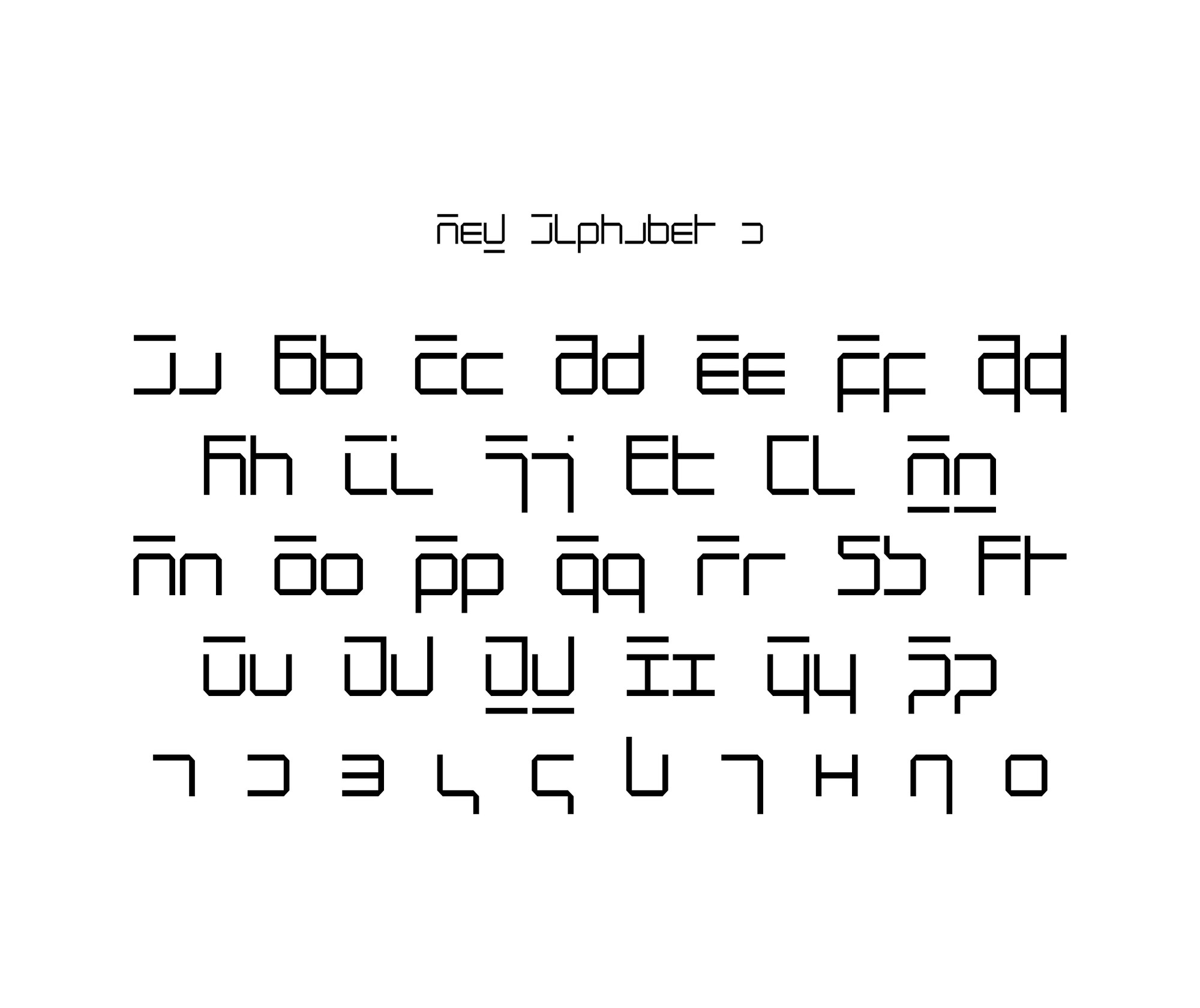 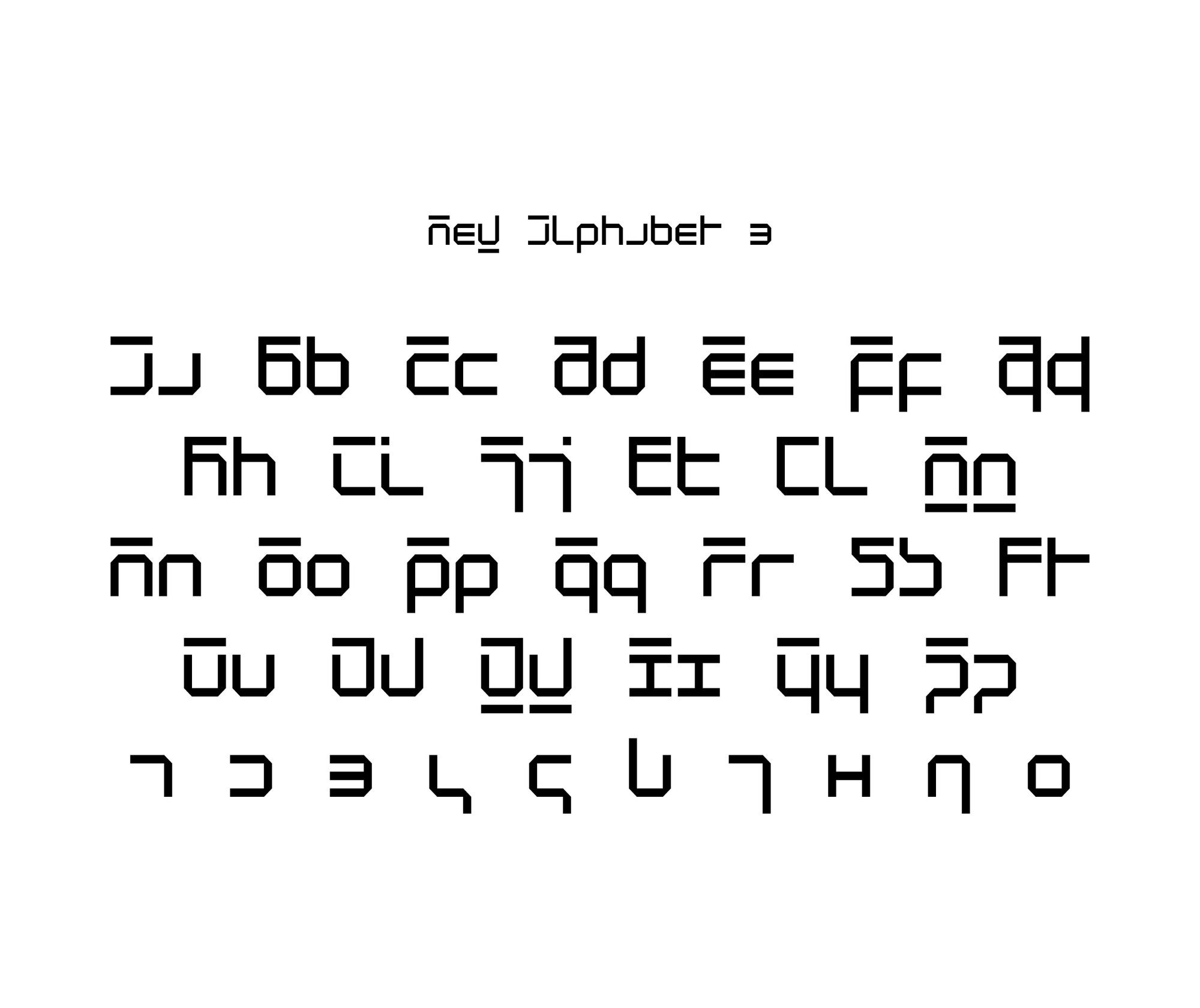 New Alphabet was featured on the album cover for Joy Division's 1988 compilation album Substance, where the album title is spelled out with characters corresponding to "subst1mce". Brett Wickens, who contributed to the cover, claimed this was for aesthetic reasons. The 1991 album reissue featured different artwork, although in the same style: the word "substance" was not spelled out; rather, the artwork featured a large green "S" in the New Alphabet typeface. New Alphabet was digitised in 1996 by Freda Sack and David Quay from The Foundry in London. It is part of the Architype 3 Crouwel Collection, and it consists of three weights. The original concept wasn't limited to three weights, but was intended as a parametric system, giving the possibly to make many different shapes by changing the parameters in the machine. In 2015, Joshua Koomen developed, based on the original instructions, a dotted version of New Alphabet. 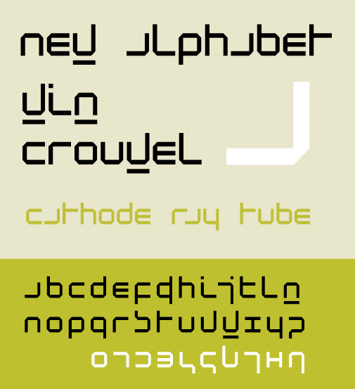 https://en.wikipedia.org/wiki/New_Alphabet https://www.fontshop.com/families/new-alphabet Sharing Widget |
All Comments